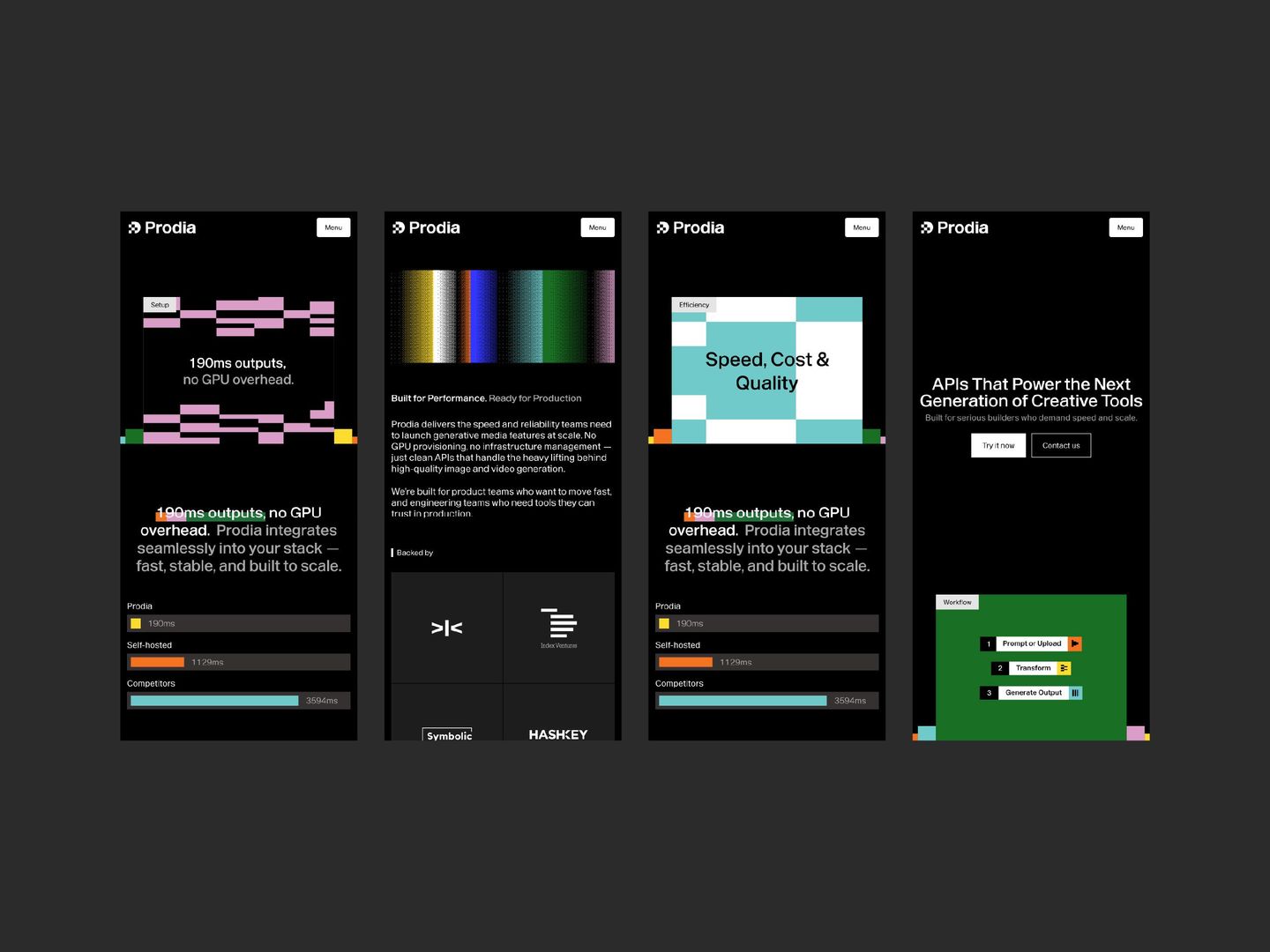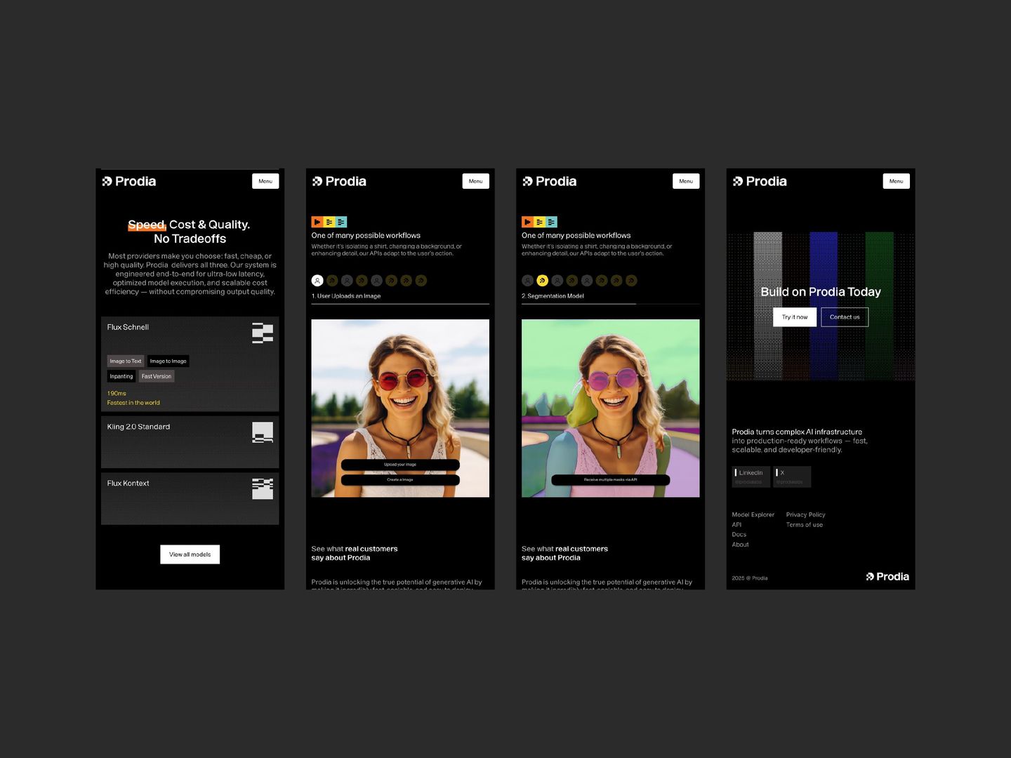
Prodia is a high-speed, developer-focused AI inference platform that provides fast, cost-effective APIs for image and video generation and editing. By hosting various open-source models, the platform enables developers to integrate advanced visual capabilities directly into applications within milliseconds without managing complex GPU infrastructure.
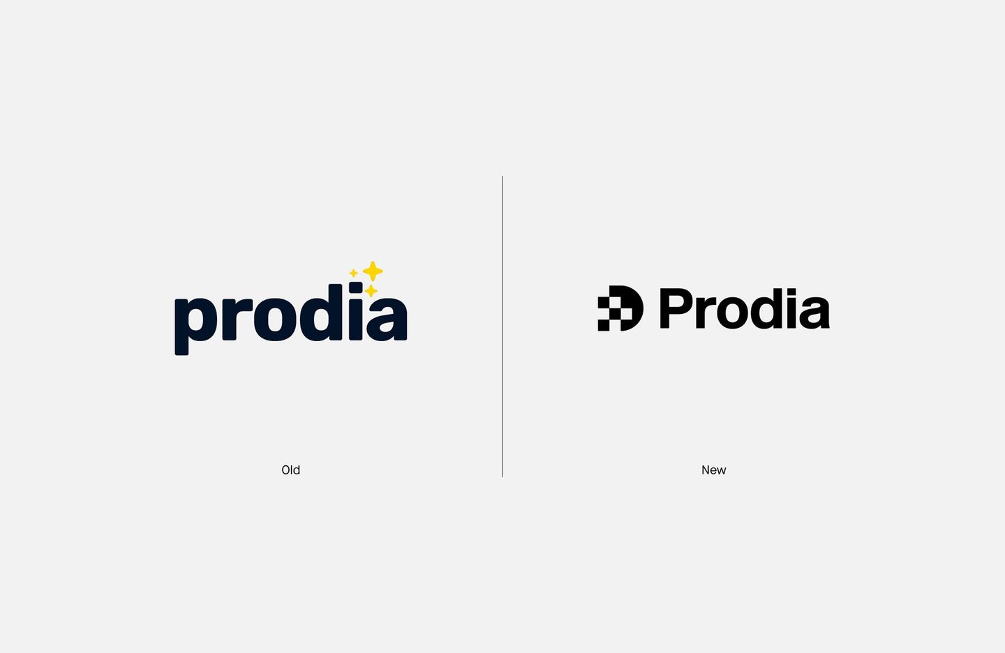
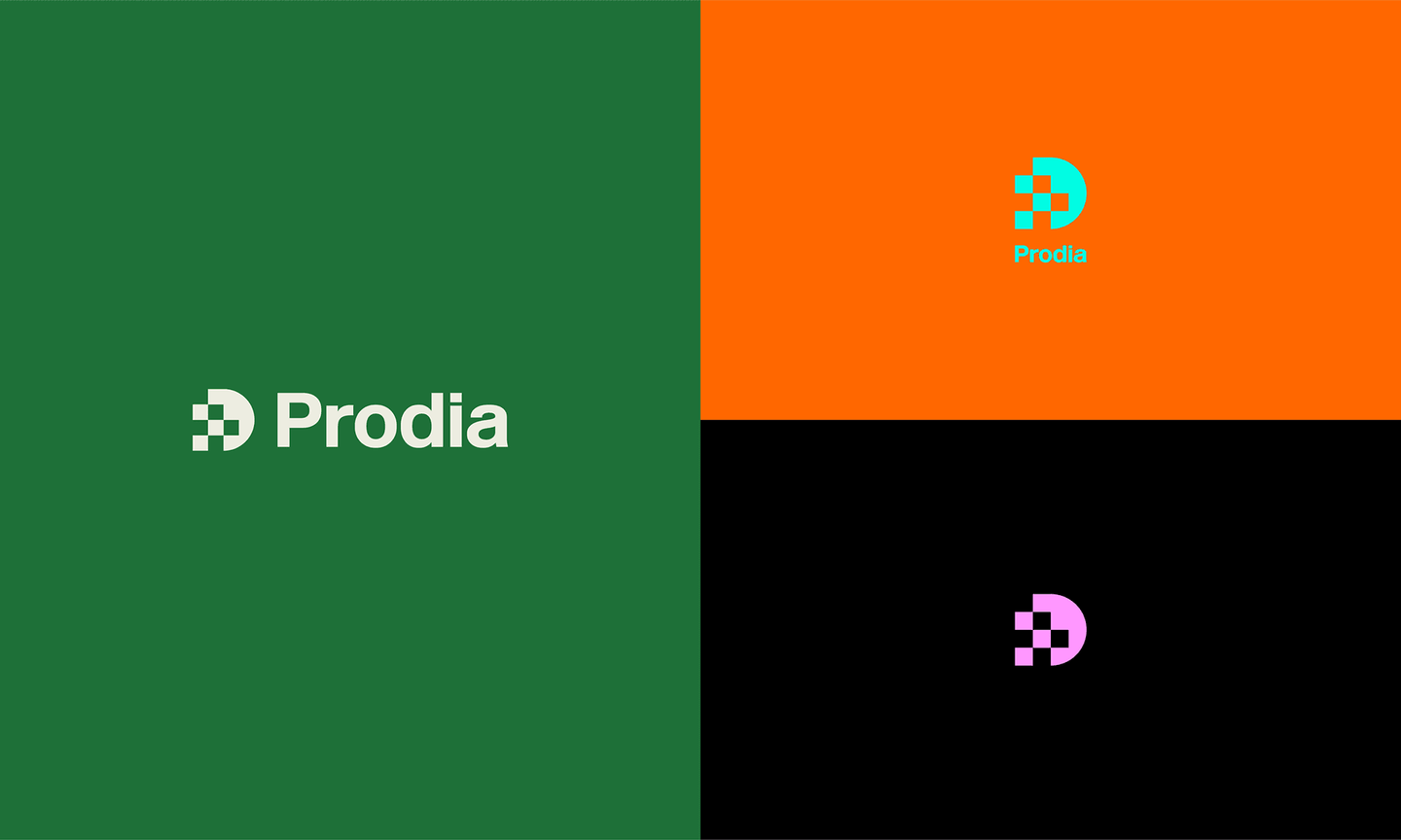
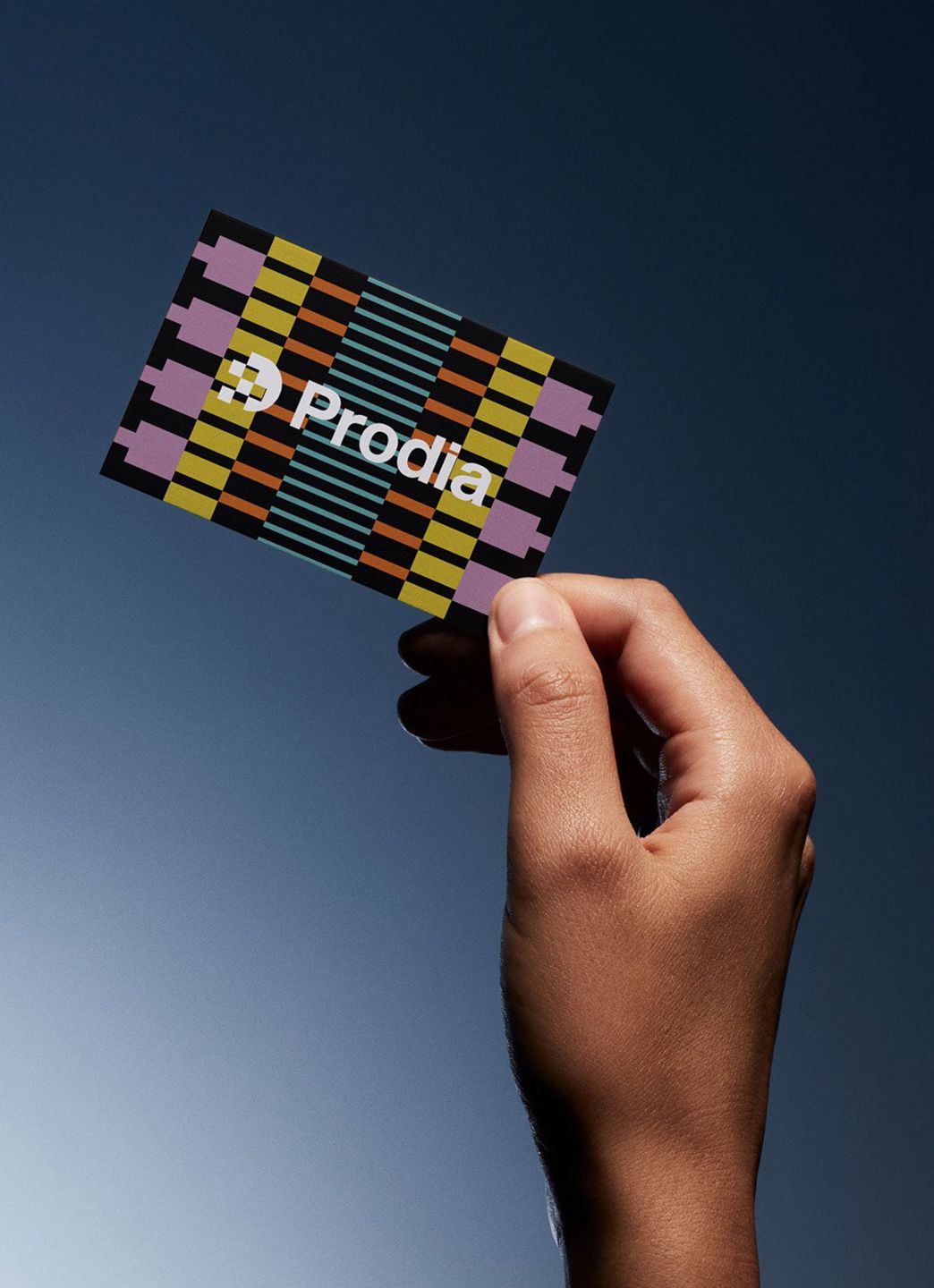
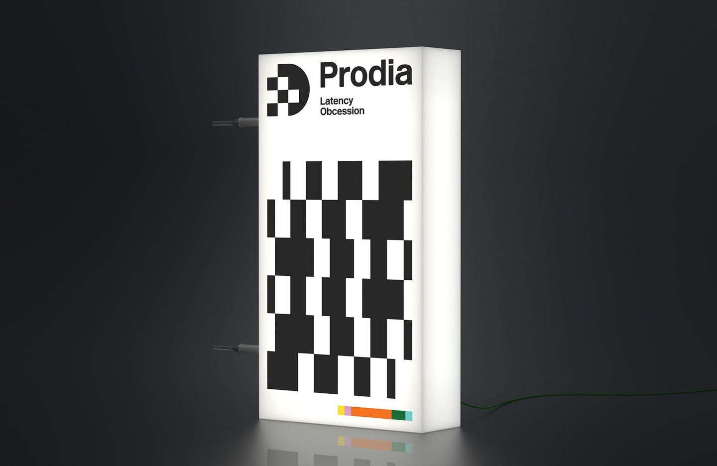
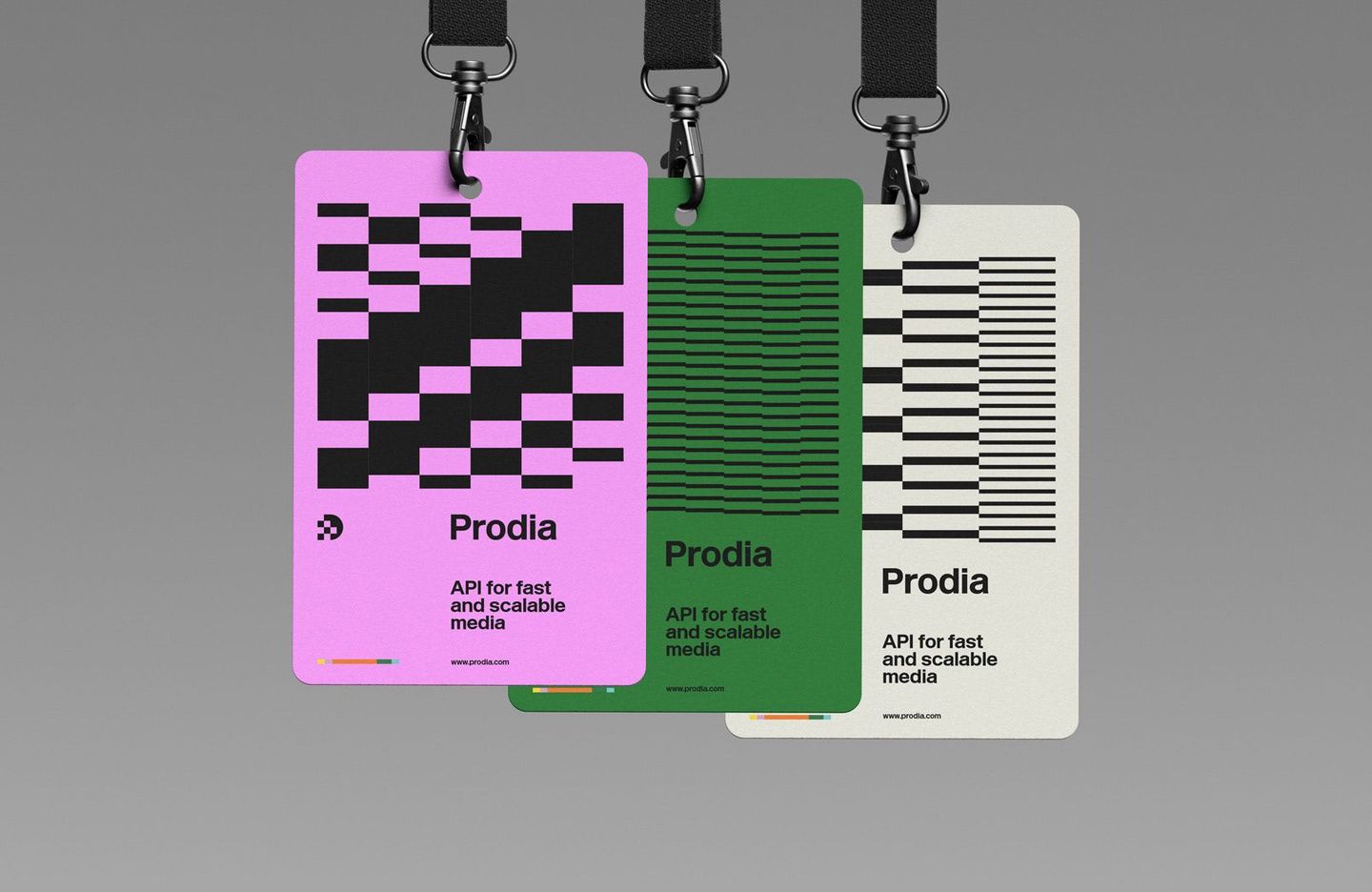
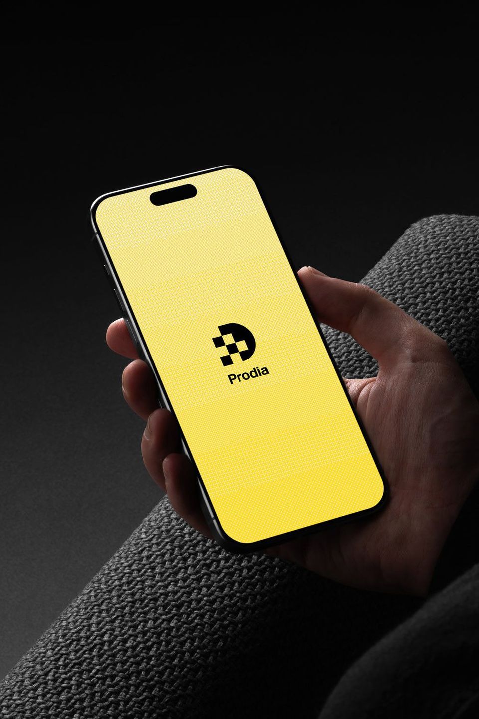
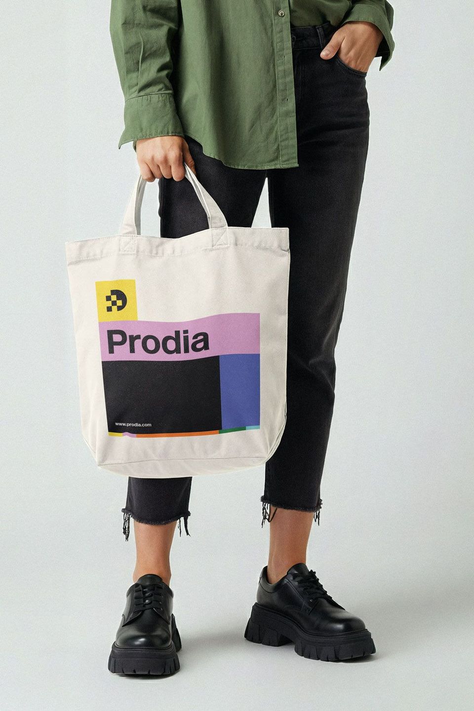
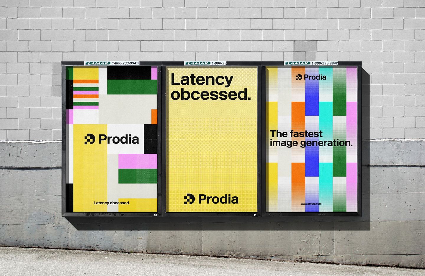
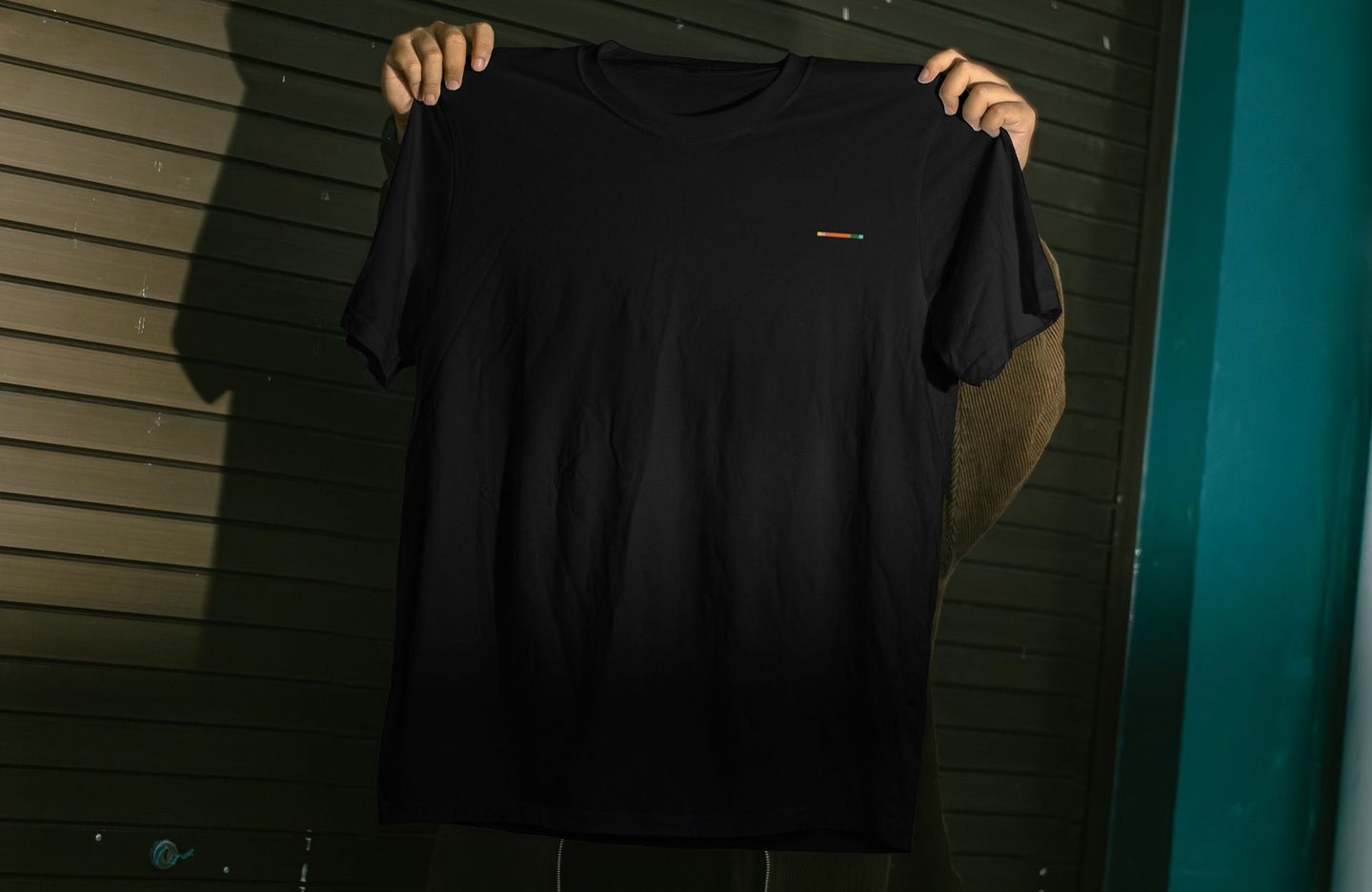
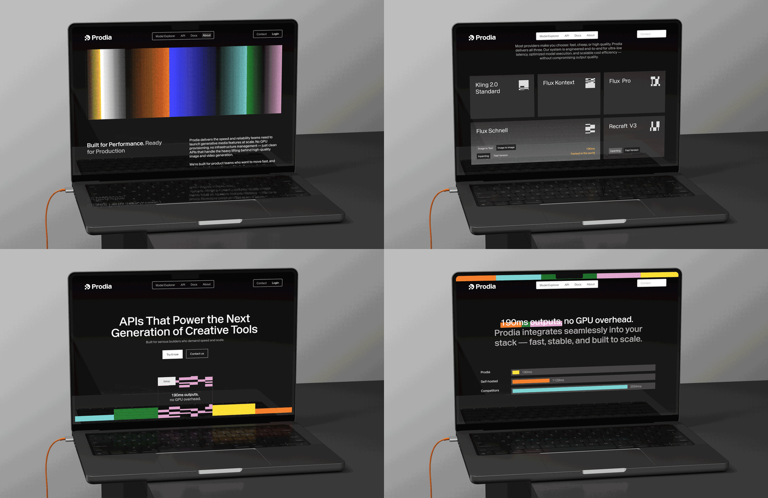
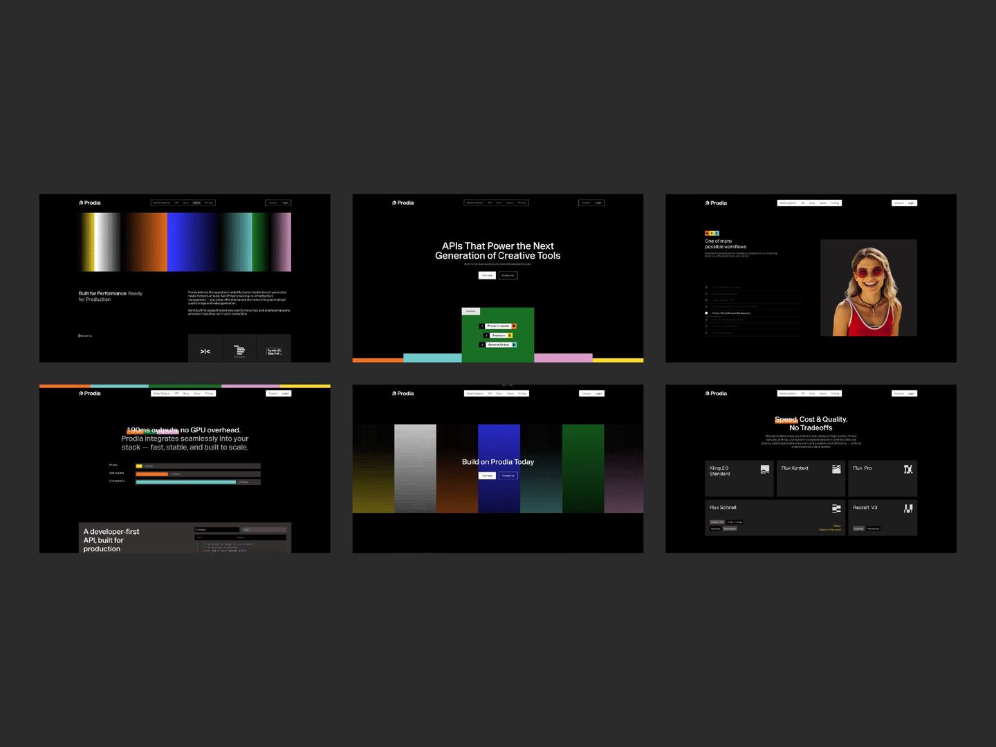
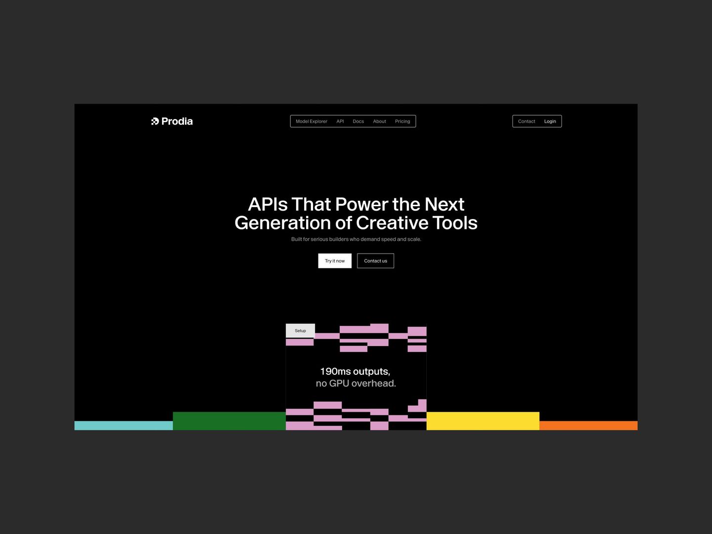
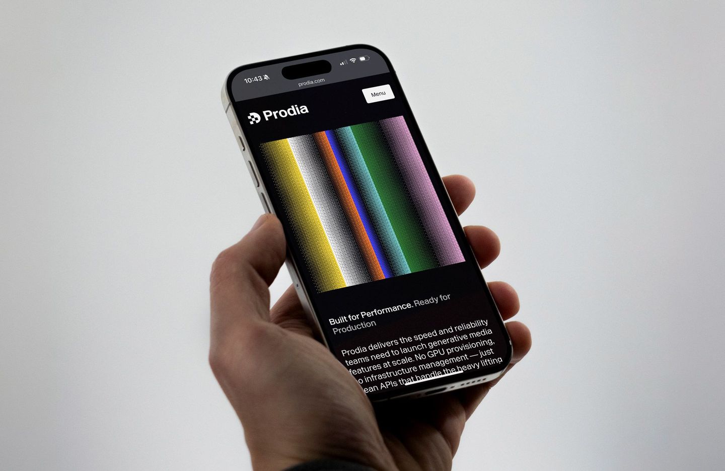
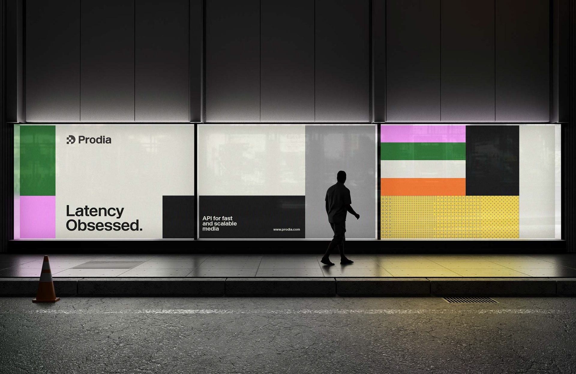
To understand Prodia’s new logo, we first need to look at its name, born from the fusion of Production and AI. At the heart of the new identity lies a simple concept: the process of generation. But how can we translate this idea into something visual? The logo brings this concept to life through the distinctive upper shape of the letter P, which appears to be forming, as if it were still being generated. More than simply breaking the shape to give the symbol character, this detail reinforces the central idea: capturing the moment when something starts taking shape. This idea goes beyond the logo and becomes part of the entire brand. Fractured shapes, dithering patterns, loading bars, and generative textures are used throughout the identity, reflecting the visual characteristics of digital generation and giving Prodia a distinctive and consistent look.